
Colours in Fractal Drawing
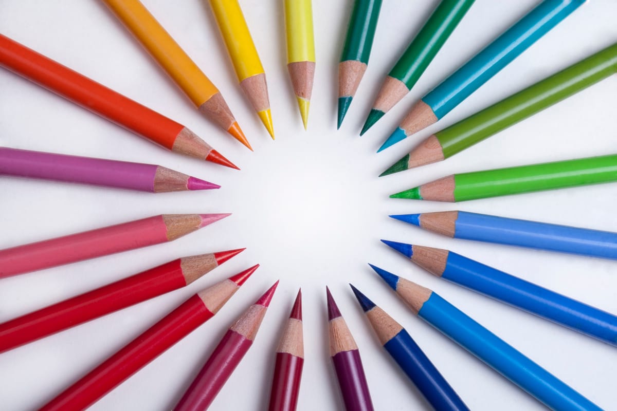
Colour in Fractal Drawing is not simply decoration added after the line is finished, it is actually an active part of the self-awareness process.
The colours are introduced according to the instructions of the method, rather than by planning a beautiful palette in advance, which means that the drawing may begin to develop in a way you would not normally choose.
Some colours may feel instantly welcome, while others can seem surprising, uncomfortable or completely out of place. You may want to avoid one pencil, use another everywhere, or change your mind as soon as a colour touches the paper.
These small reactions are worth noticing.

We all know which colours we like, which combinations feel safe and what we believe looks good together. When the method gently interrupts these habits, it creates an opportunity to observe how we respond when things do not immediately match our expectations. Do we stay curious? Do we try to regain control?
This also does not mean that one colour has one fixed meaning, because Fractal Drawing is not based on a simple chart where blue always represents one emotion and red another. A colour only becomes meaningful within the context of the whole drawing, the process itself and the individual person.
As the spaces gradually fill, colours that first appeared disconnected often begin to form relationships. The picture changes, but our experience of it may also change.
A colour you would never have chosen may become an essential part of the whole, and sometimes, allowing that unexpected colour onto the page is already a small exercise in seeing beyond our usual preferences.